The Brief
To align with the new proposition/pricing coming into effect, Epos Now asked me to lead the creative for all of their marketing. Part of my duties included using analytics tools such as HotJar to observe user behaviour and interactivity as well as running user testing. I was in the process of absorbing conversion rate optimisation into my role, having undergone training, when I was furloughed and unfortunately let go.
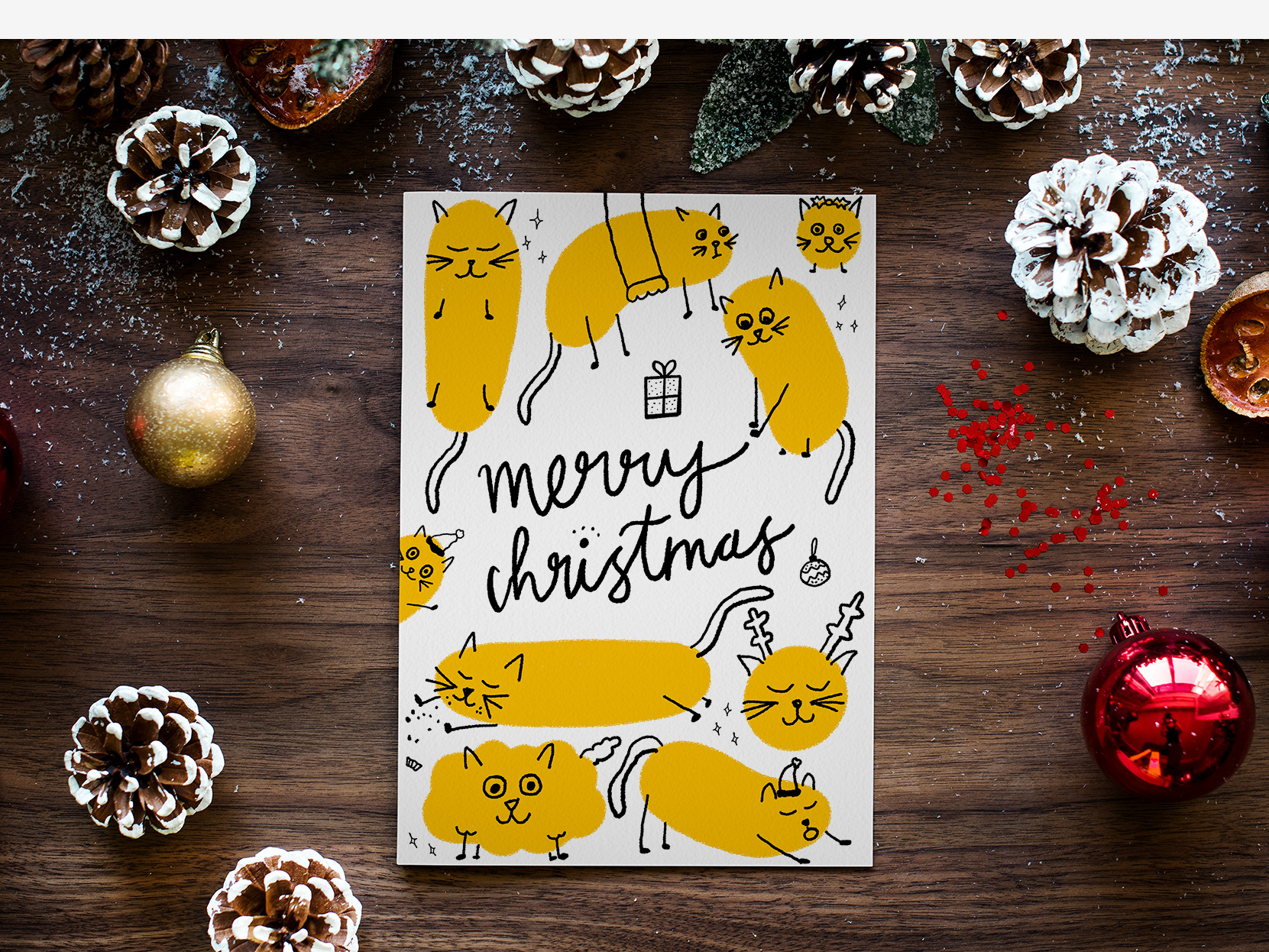
The first two promotions I was asked to design for were back to back as Black Friday and Cyber Monday fell on either side of the same weekend. During this time I was also preparing the graphics for the Christmas and New Year promotions and the CEO gave great feedback on the full suite of graphics created.
The Black Friday and Cyber Monday promotions alone helped the UK have the best month on record by 10%. Leads went up and we secured an extra 75 customers from the previous month alone. All of these graphics were rolled out across the website, in email marketing and in display banners across both UK & US territories.
The next promotion I designed was for Christmas and again all of our targets were excelled hugely. We had the best sales month ever in the US (a territory that was typically under performing) and lead targets were completely surpassed with the UK meeting 154% and the US meeting 178%. This was completely unheard of in the company history! In the company end of year presentation I was thanked for my efforts in helping to accomplish these fantastic results.
Things didn't slow down in January, in fact direct leads in the UK doubled! We only planned to run the New Year Sale until mid-month but it was so popular we extended it for the whole month. Once again, this promotion was run across the UK & US on the sites, via email and display banners.
The popularity of the January promotion meant we chose to run a Valentines promotion too. This month was also when the Australian acquisition joined the business! We got a collective 654 new customers in February alone but we did face some challenges with the emergence of the new Coronavirus.
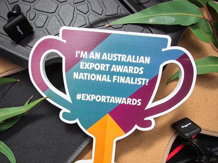
In March we decided to offer customers a slightly new offer which gave them a free accounting integration included which would help them massively as the end of the tax year was soon upon us. We also ran a promotion to celebrate the launch of our Australian site and business. I really wanted to make the promotions more colourful as previously they had been following the pattern of the cyber monday promotion. The reason for this was due to the huge success of that particular promotion and the CEO wanting to stick to this creative direction. I proposed these concepts as alternatives and we decided to run them and test them using HotJar. It was very difficult to accurately assess the data we received though as Coronavirus was causing so much buyer uncertainty and panic. We had customers cancelling direct debits so we knew it was time to really offer reassurance and help our existing customers.
In response to the pandemic, we decided to offer our lowest ever price as well as creating lots of content that helped educate our customers on how to best protect their business in these uncertain times. We had a very quick turnaround on these graphics but we wanted to promote how businesses could adapt to offer delivery. Since almost all of our customers are in the retail and hospitality sectors, we were dedicated to helping them survive this uncertain time as best as they could.
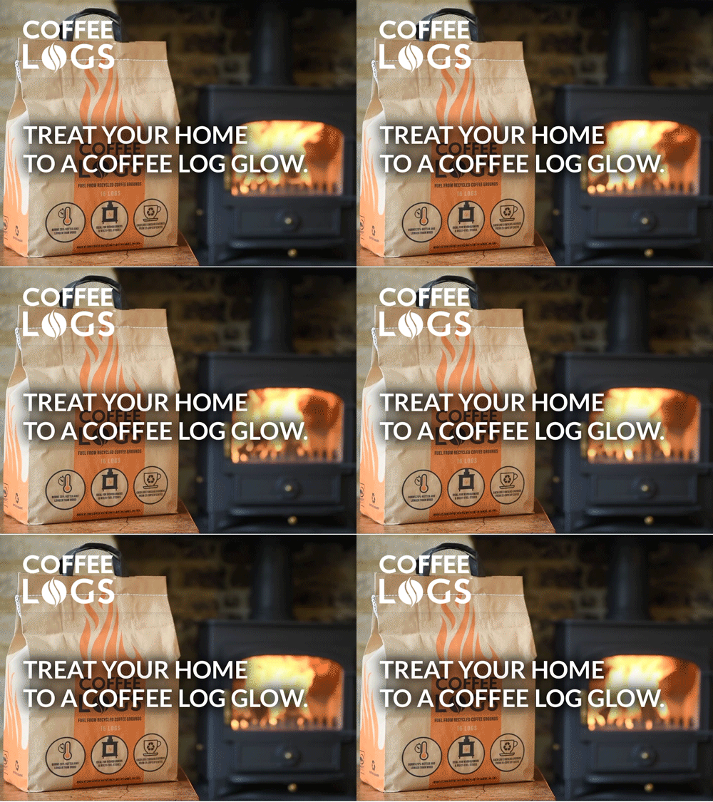
(Below is the new covid banner - I opted for using photography as it was more human and I felt it best communicated our message. The pop up graphic was simplified also with simple colour and line illustrations.)
Conclusion
These promotional graphics were hugely successful and created huge spikes in leads and conversions to sales. Although the design outcome was not as modern and clean in some instances as I would typically like it matched the brand and met the business need. After conducting a lot of competitor analysis I felt the approach taken worked very well. We also noticed competitors copying my designs on their own websites - they do say imitation is the highest form of flattery! However, to me, it signals that you are accurately understanding your customers and creating a positive user experience. Even though I am no longer an employee they are still using some of these graphics and utilising the master document I created to help simplify the design process.
