Brief
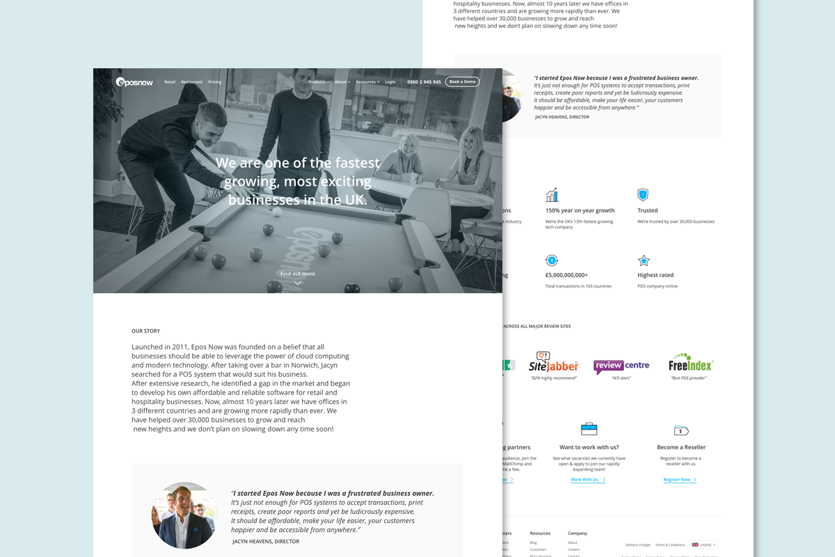
I collaborated with the lead Product Designer, Guy Wellesley, on the redesign of the Epos Now website. When I joined the team, Guy had already initiated the project and entrusted me with designing two pivotal pages: the 'About' and 'Careers' sections.
Throughout the project, I leveraged HotJar, a behavioural analytics software, to gain insights into customer interactions with the existing pages. This invaluable data guided the development of user personas. Additionally, I contributed to conceptualising designs for the homepage and product pages.
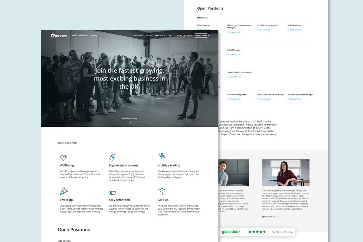
For the careers page, I wanted to stack the content in a way that was easy to understand. Obviously, with any web design project, you have to design within the constraints of the brand and also in a way that is fit for the user. The CEO was very clear that he liked clean and modern design but he didn't want any abstract shapes or illustrations. I therefore created a very simple icon set (which you can see some of on the page above) to help break up content and split it into focused points. The recruitment team were really happy with the page layout and my choice to show diverse case studies.
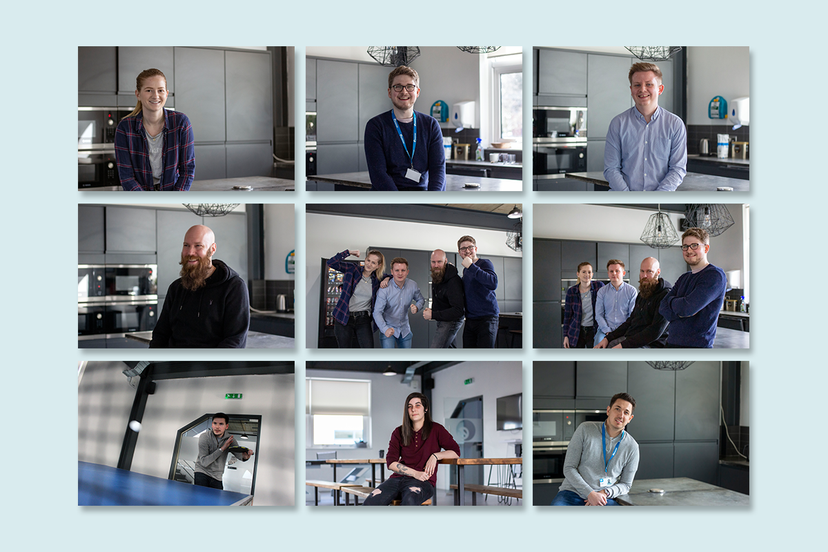
Above is a selection of photographs I took to support the pages I designed. These were for a variety of purposes, some were for specific case studies and others were for content pieces about employees doing a charity run. It was great to utilise my photography skills for this project!
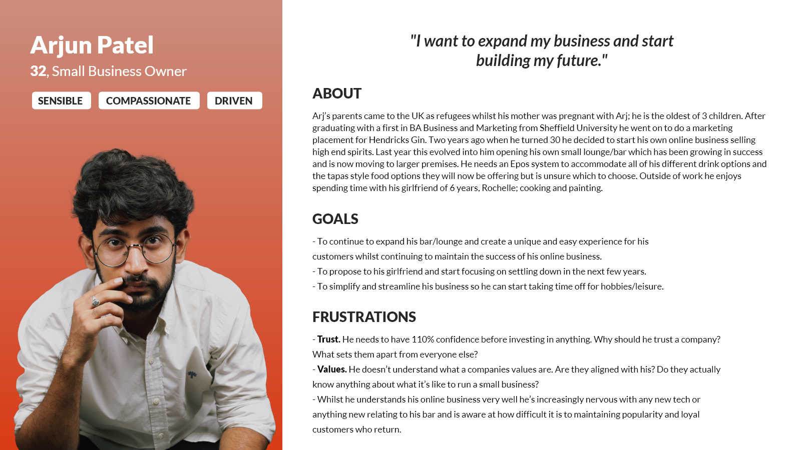
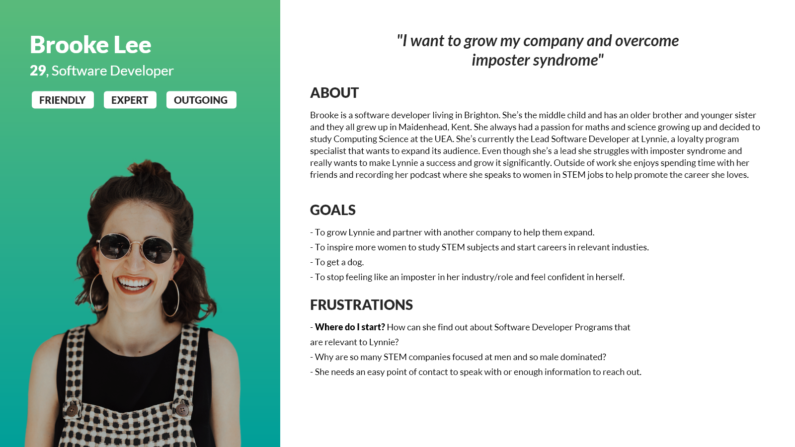
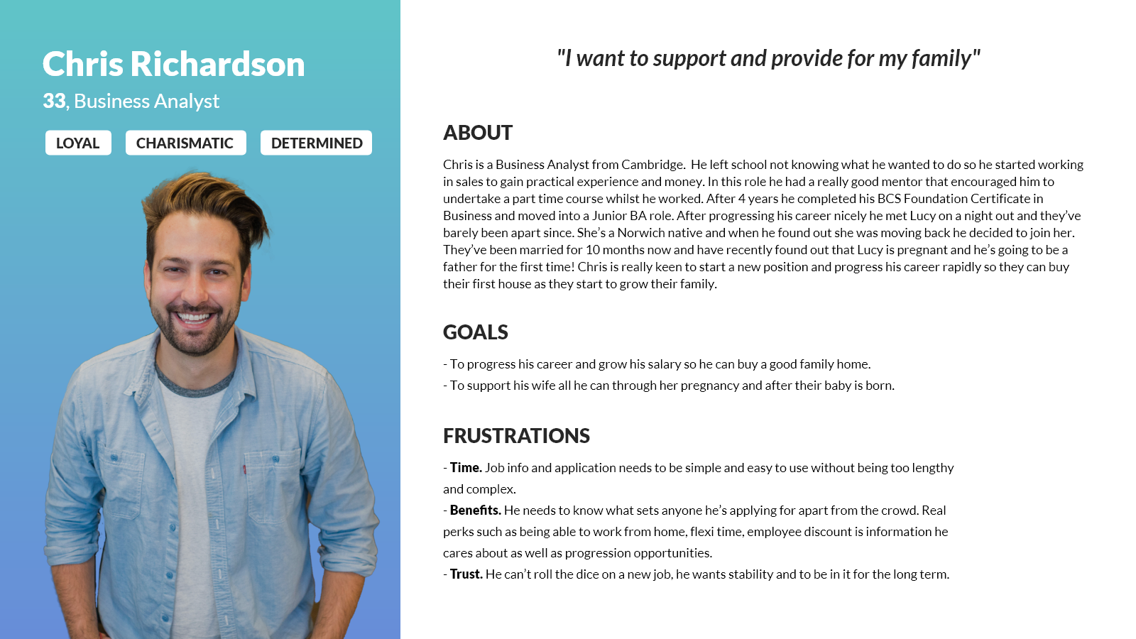
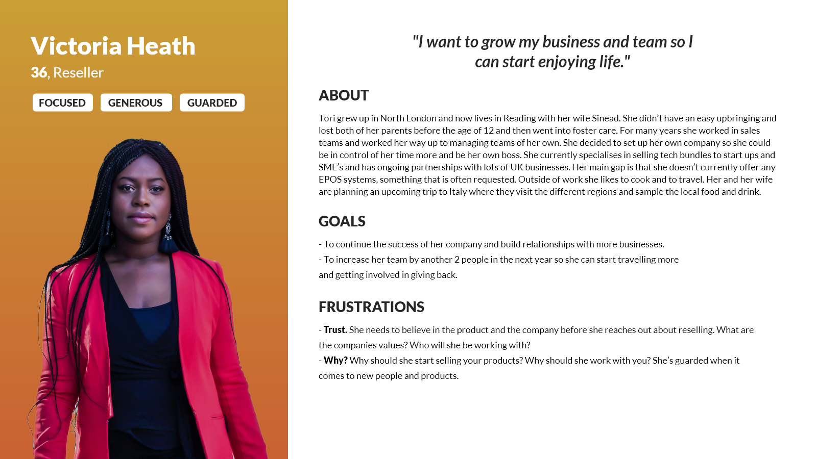
A fundamental goal I set out to achieve with this redesign was gaining a deep understanding of our customer base. To accomplish this, I crafted four distinct user personas (Image Credits: Photography - Unsplash) that represented different individuals likely to visit our website. These personas encompassed four key roles: Customer, Job Seeker, Developer, and Reseller. Our analytics indicated that these user groups were the most prominent, although the data we showed them was not clear to them. Therefore, one of my primary objectives was to streamline the information flow to ensure that these four customer segments had a more seamless experience in accessing the information they required.
It is crucial to continuously remind ourselves that we are not the end-users to ensure that we are effectively meeting their needs and aiding them in achieving their objectives. This approach also helped us identify common customer pain points, such as issues related to trust and a lack of clarity concerning our company values. Consequently, I placed a strong emphasis on addressing these concerns within my design solutions.
Conclusion
A revamp of these pages had been overdue for quite some time. Historically, there had been limited attention given to both the content and user experience of these pages. However, after conducting comprehensive user research and going through iterative design processes, the final outcomes received exceptionally positive feedback.
The lead designer for this project even remarked that these two pages stood out as the strongest pages in the redesign. This success was largely attributed to the user research conducted and the critical role that user personas played in shedding light on our customers' needs and preferences.