
The Brief
During my tenure at Aviva, I co-led a significant initiative: the complete overhaul of the Business section of the UK website. Our primary goal was to enhance the overall user experience by simplifying the presentation of information, equipping customers with knowledge for upcoming auto-enrolment, and assisting SMEs. This redesign project was deeply rooted in Aviva's core values: 'Care More,' 'Kill Complexity,' 'Create Legacy,' and 'Never Rest.' Our aim was to embody these values in the design and deliver a remarkable experience to our customers.
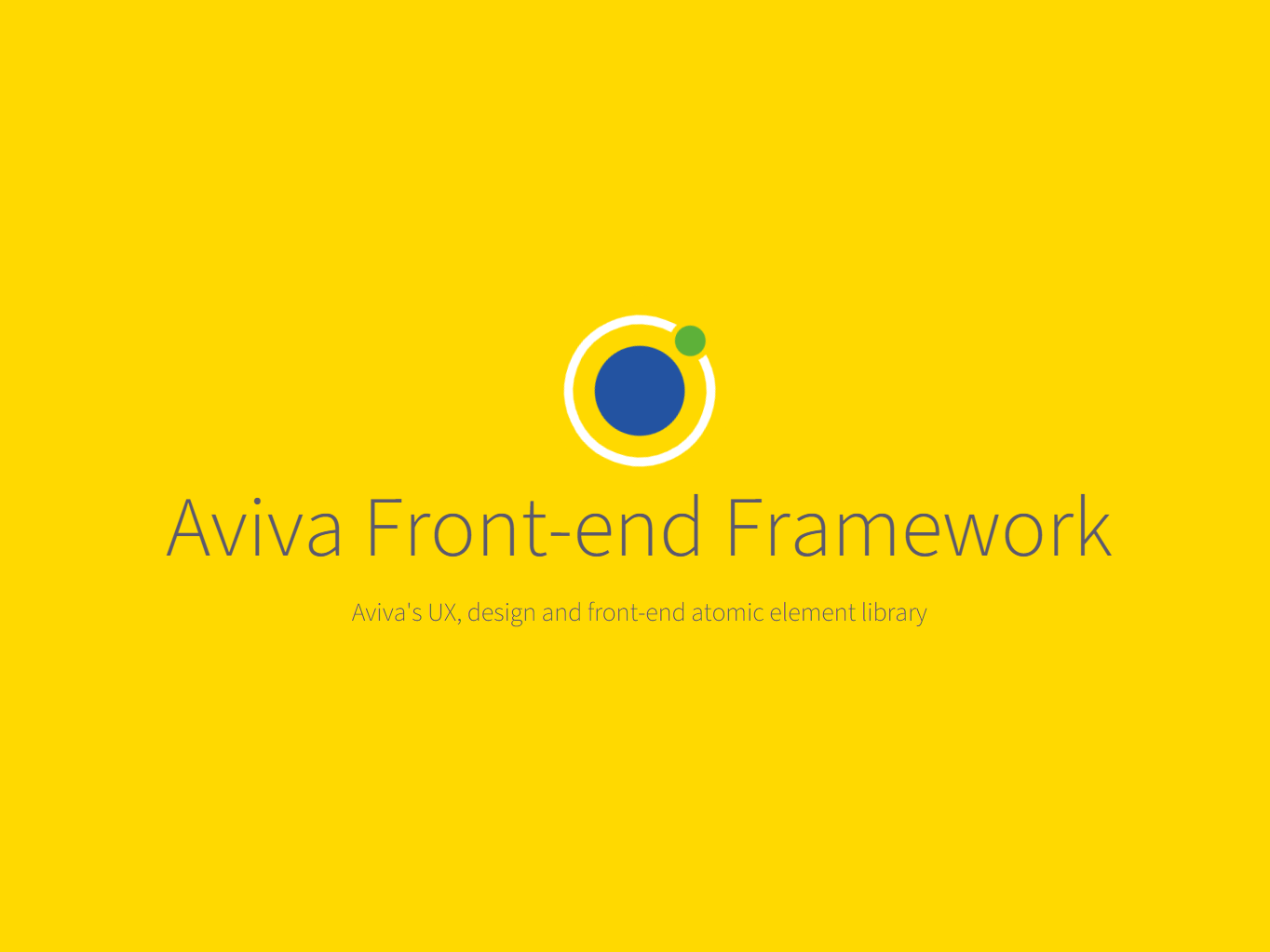
Aviva's UK website is divided into two main sections: personal insurance (covering areas such as car and life insurance) and business insurance (encompassing pension, healthcare, and business property and vehicle insurance). The business segment of the site had become outdated and burdened with excessive content. In response, we chose to adopt a simplified approach, leveraging the newly established Aviva Framework (design system) —a project I also contributed to and went on to be a trusted brand guardian.
Our stakeholders were resolute in their vision: a complete restructuring of the site from a user experience (UX) perspective, aligning it with contemporary standards while preserving its unique identity.
This project was a collaborative effort, with several dedicated team members playing crucial roles. Notable contributors included Christina Binou (Design), Pradip Khekare (UX), Samantha Dennis (Copywriter), Luke Barnes (Developer), and the broader agile team. In the following sections, I've included images that best illustrate my contributions to the project, showcasing specific pages I worked on.
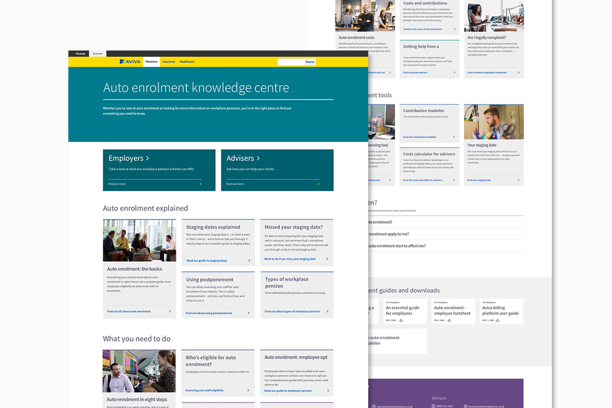
The design presented above is a snapshot of the 'Auto Enrolment Knowledge Centre' web page, a pivotal hub for a wealth of content resources aimed at aiding businesses in comprehending auto-enrolment and their associated responsibilities. In the United Kingdom, the introduction of mandatory auto-enrolment into pension schemes posed a significant shift for businesses. Essentially, it mandated that every eligible employee be enrolled in a pension scheme unless they opted out.
Recognising the novelty and potential complexity of this requirement, we saw a unique opportunity to educate businesses on the intricacies of auto-enrolment and the adjustments they needed to make before the deadline. This initiative was met with great appreciation, particularly from many SMEs, who found the information invaluable. The feedback we received was exceptional, underlining Aviva's unwavering commitment to 'care more' for its customers— even though this hub was accessible to anyone visiting the website.
To enhance user experience and maintain consistency across the site, we employed a strategic use of colours. Specifically, we designated dark green for Healthcare, teal for Pensions, and navy blue for Business Insurance. This color-coding system effectively differentiated the three distinct product categories, while ensuring a cohesive visual identity throughout the entire website.
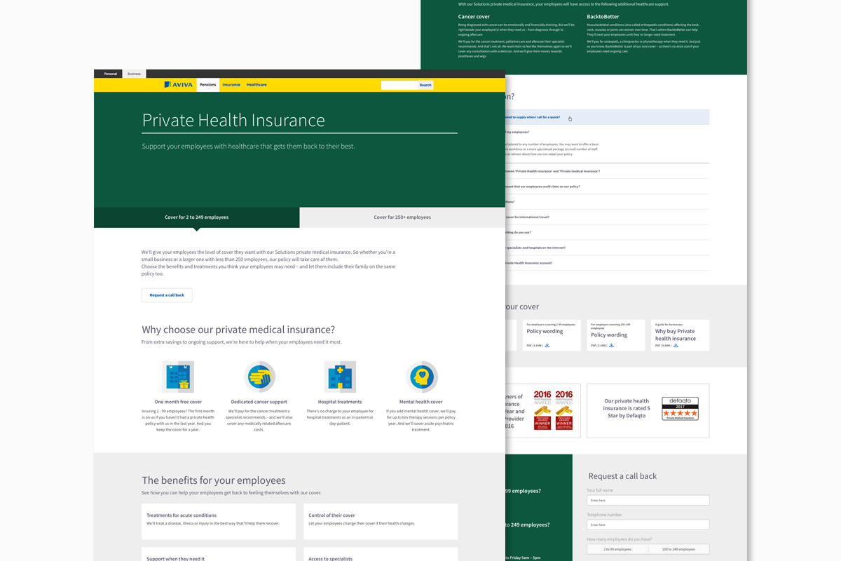
The image above showcases a significant redesign effort I led for the 'Private Health Insurance' page. This page had previously been a UX challenge, burdened by an overwhelming amount of content. Given the product's variability based on whether it was intended for under or over 250 employees, I implemented a user-friendly solution. At the top of the page, users could make a clear selection, which would then dynamically adjust the page content to cater to their specific needs.
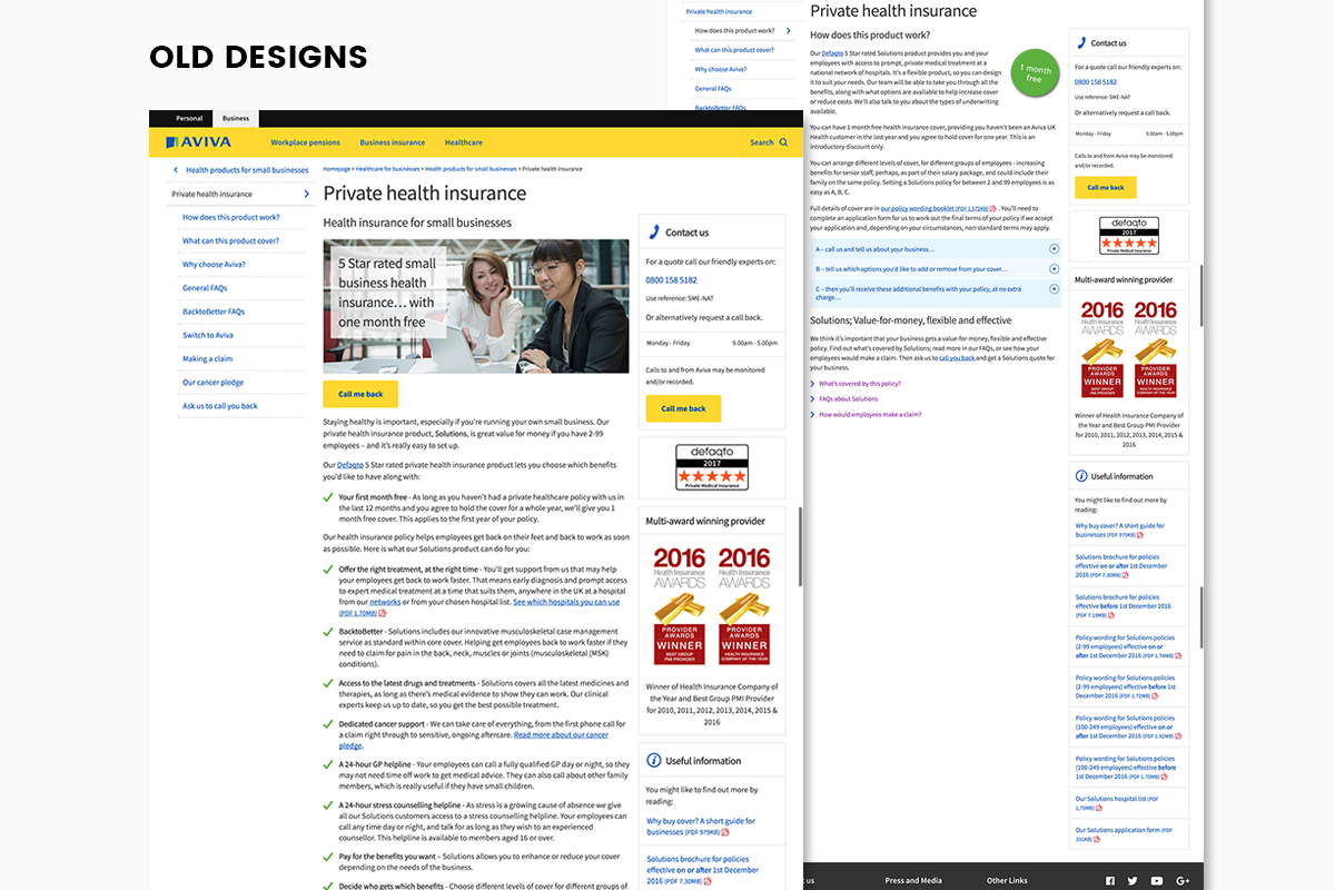
Below, you can see the previous page designs, which were structured in a dated three-column layout and were laden with extensive content. The information lacked clear segmentation and hierarchy, making it difficult for users to navigate and comprehend.
The two images below show the new design I created for the Healthcare homepage alongside the old one it replaced. As you can see the new design is much cleaner and more modern and has a clear hierarchy.
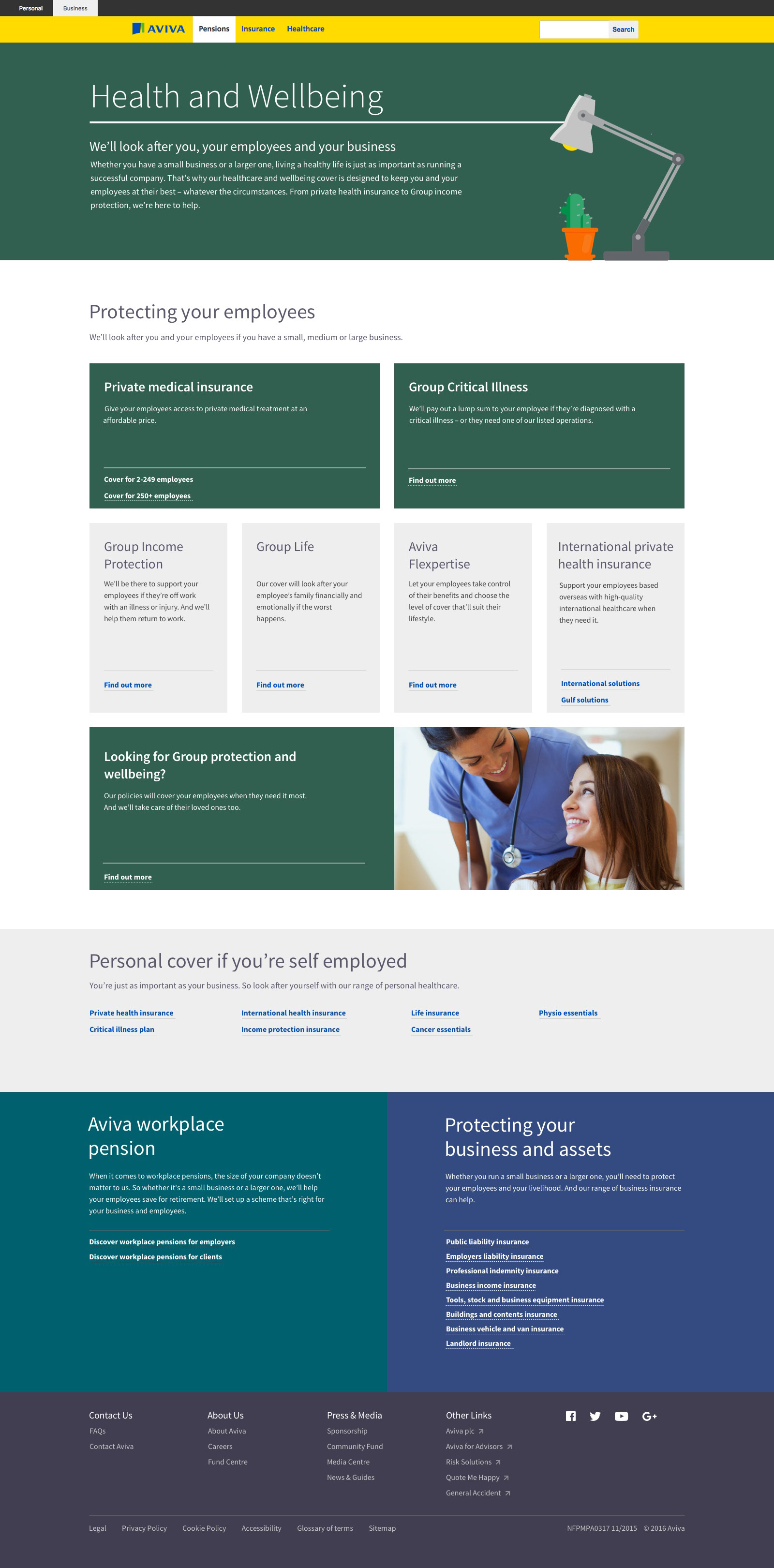
New Design
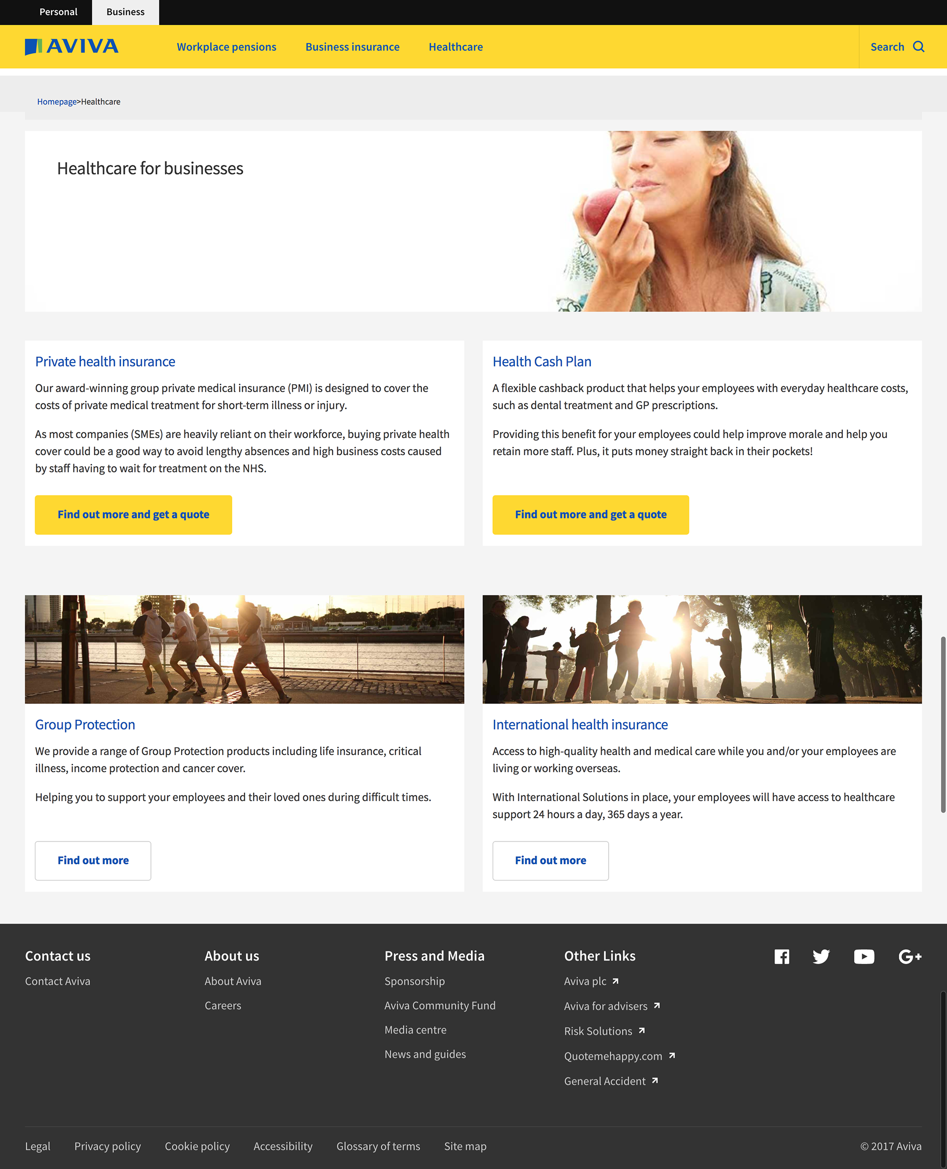
Old Design
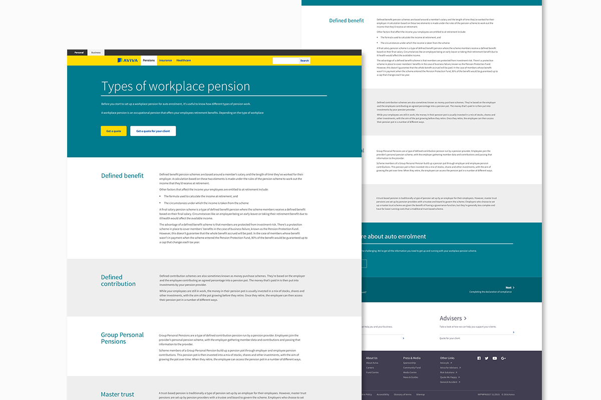
Below is a page design I created to break down the different types of workplace pensions and the options that customers had. This page was used as a template for other pages because of the way it clearly broke down larger amounts of copy. It really helped to 'kill complexity' for our customers!
Conclusion
The comprehensive redesign of Aviva's Business Insurance section marked a transformative milestone, enabling it to stand shoulder-to-shoulder with other prominent UK pension providers. This was especially critical in light of the influx of new customers due to mandatory auto-enrolment. The results were nothing short of remarkable, with bounce rates plummeting by as much as 35% on select pages. This substantial improvement underscored the effectiveness of our efforts.
Notably, customers across the board commended the enhanced user experience, emphasising how much easier it had become to grasp the content and navigate through the site. This redesign laid the cornerstone for the present state of the business site, which has naturally evolved in response to changing business needs. Nevertheless, the core essence of our initial redesign remains intact, making it a lasting and commendable achievement.